Success storiesAdMore Lighting
Before and after
AdMore Lighting, rebuilt around the rider.
Two decades of Calgary-built motorcycle lighting, and a site that read like a parts list. I rebuilt it around what riders actually buy: being seen.
Before and after
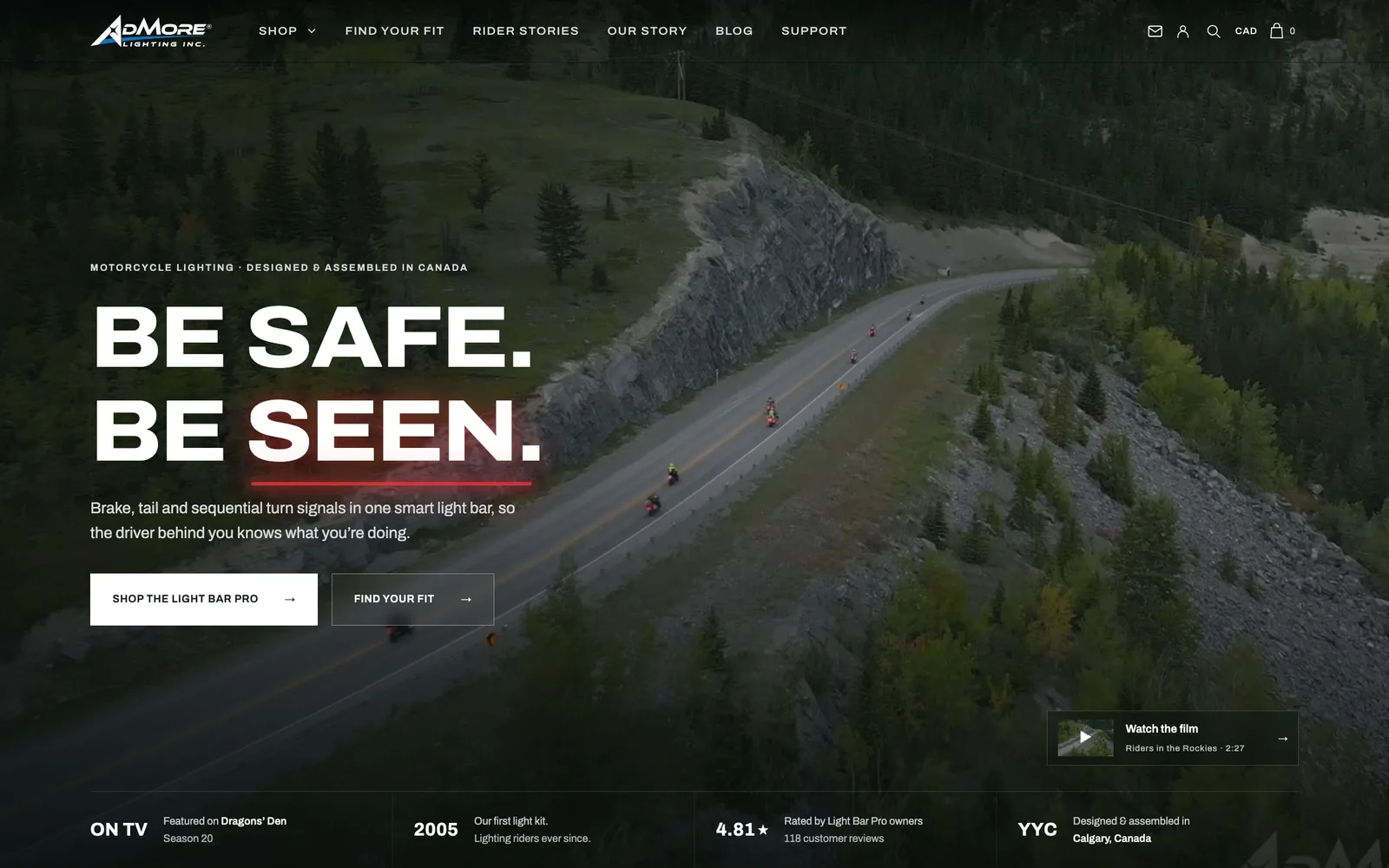
Before: the current admorelighting.com homepage, captured in September 2026. The new site is launching soon.
On a phone
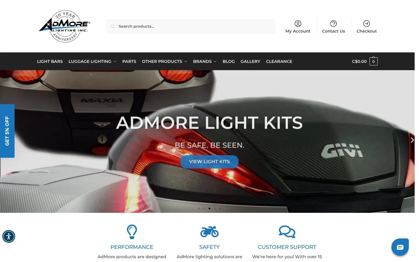
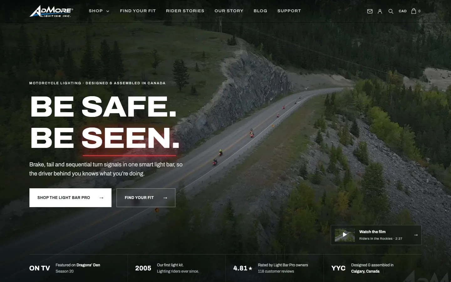
The new homepage on an iPhone. Hover a phone to scroll the page.Tap a phone to scroll the page.

What wasn’t working
- A generic photo carousel where the brand story should be.
- A crowded header: a search bar, three account links and eight menu items competing.
- 551 products across 79 categories, with no clear path to the right fit.
- The best proof, Dragons’ Den and 845 five-star reviews, easy to miss.
What I changed
- 01
A story-first hero
The carousel is gone. A riding film now carries one clear promise: “Be safe. Be seen.”
- 02
The hero product, explained
The Light Bar Pro gets its own chapter, with a 3D viewer and a plain-English brake explainer.
- 03
Proof up front
Dragons’ Den, the 4.81 star owner rating and “designed in Calgary” sit right under the headline.
- 04
Riders, not reviews
Video stories from real riders on real roads, each tagged with the bike they ride.
- 05
Six clear menu items
Shop, Find your fit, Rider stories, Our story, Blog and Support. That’s it.
- 06
A catalogue you can browse
The brands regrouped into collections, each with one line on what it’s for.
Line by line
What changed on the homepage, side by side.
| Item | Before | After |
|---|---|---|
| First screen | A product photo carousel | A riding film and one promise: “Be safe. Be seen.” |
| Header | A search bar, three account links and eight menu items | Six clear menu items |
| Proof | Dragons’ Den and the reviews, easy to miss | Dragons’ Den, the 4.81 star rating and “designed in Calgary” under the headline |
| Catalogue | 551 products across 79 categories | Brands regrouped into collections, each with one line on what it’s for |
| Social proof | Star ratings | Video stories from real riders, tagged with their bikes |
The new homepage, top to bottom